
Three Prompts in One, Oh No!
My first triple prompt for my 500 Drawing Prompts project!
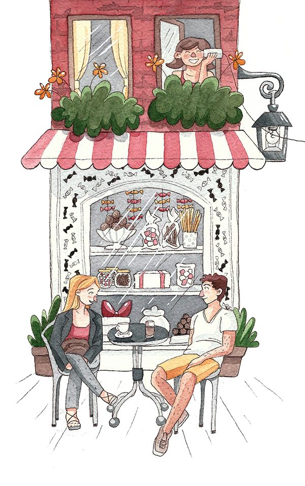
I was a little scared in the beginning, but then I was thankful that my background was already set by the first prompt word shop. Drawing shops is something that can be a lot of fun, especially when they sell food.
Now I had to come up with an idea for wire and repeat. Because it’s really hard to demonstrate a repeated action on one single picture, I decided to use a repeating pattern on the shop front. I think it fits very well into the theme.
Wire was the most complicated prompt word. It’s so boring! After a while of pondering I came up with the telephone idea. The original sketch also included the neighboring house and two people talking to each other, but I didn’t like the composition. So I decided to leave out the house on the right and focus on the shop house. It’s also much more interesting when you don’t see who the girl is talking to. It leaves room for imagination. Is she talking to her boyfriend? Or is it the neighbor’s daughter that she has known since childhood?

There is Something Missing
At this point, the idea for the sketch was pretty much done, but I thought the picture is still missing something. Shops need customers, right? I also wanted to challenge myself and added two additional characters to round up the whole picture. One could argue that they distract the viewer from the actual prompt elements, but I don’t think that this has to be a bad thing. The prompts are there to get my creative juices flowing. It’s not the goal to keep them in focus.

New Paper, New Workflow
As you can see I used a different workflow and coloring style for this illustration. This has mostly to do with the very textured paper I used. Usually, I go over my watercolor illustrations with colored pencils, add more shading and detail as well as the outlines. I figured that this wouldn’t look good on the rough paper and therefore opted for a fineliner for the linework and watercolor for the coloration.
 I did a color test on my iPad before coloring the sketch on paper. The colors turned out much darker in the end, and I also changed up some things completely. It really helps to not get overwhelmed while painting.
Conclusion
This illustration really pushed me to the limits. I often tend to draw only one or two characters, which can get quite boring. I also like the composition even though it’s a simple front view. And I really like the paper. Normally I’m not satisfied with the coloration before I add depth using my colored pencils, but the paper soaked up the pigments very well! Oh, and in the end I noticed that the lamp is HUGE, haha.
Art supplies used
- Arches Cold Pressed paper 300 gsm
- Prismacolor Col-Erase Vermillion
- White Nights Watercolors
- Pigma Micron 01 fineliner (dark brown)
- uniball Signo white gel pen
- Daler-Rowney E51 Liner size 2
- Self-made light box